
The Benefits of Responsive Web Design for Birmingham Restaurants
In today’s digital age, a restaurant’s success extends far beyond the deliciousness of its dishes. It’s about the experience—the anticipation that starts with the click of a mouse or the tap of a finger. Birmingham’s thriving culinary scene knows this well, and it’s time for every restaurant in the city to embrace the online revolution.
Imagine a scenario: A Birmingham resident is wandering the streets, searching for a place to dine. They pull out their smartphone, do a quick search for “best restaurants in Birmingham,” and within seconds, they’re greeted by a list of options. Your restaurant is on that list, but will they choose you?
This is where responsive web design becomes not just a luxury but a necessity for Birmingham’s restaurants. Your website is your digital storefront, your virtual maître d’, and your ambassador in the vast landscape of the internet. It’s the bridge that connects you with the hungry patrons of Birmingham.
The purpose of this article is crystal clear—to delve into the captivating world of responsive web design, tailor-made for Birmingham’s restaurants. We’ll uncover how this design philosophy isn’t just about aesthetics; it’s a strategic tool that can amplify your online presence, delight your customers, and drive growth for your restaurant.
So, as we embark on this culinary journey through the digital realm, prepare to savor the benefits of responsive web design, and discover how it can elevate the dining experience for Birmingham’s restaurants. Let’s begin this delightful exploration of the boundless opportunities that await in the world of responsive web design.
Understanding Responsive Web Design and Its Importance
In the digital age, the concept of “responsive web design” has become more than just a buzzword—it’s a transformative approach to crafting online experiences that resonate with users. But what exactly is responsive web design, and why is it a game-changer for Birmingham’s restaurants?
Responsive web design is a design philosophy and approach that prioritizes creating websites capable of adapting and scaling seamlessly across various devices and screen sizes. Whether your potential customer is browsing your restaurant’s menu on a laptop, smartphone, tablet, or desktop computer, a responsive website ensures that the content, layout, and overall user experience remain consistent and optimal.
The relevance of responsive web design in Birmingham’s bustling restaurant scene cannot be overstated. With mobile devices becoming ubiquitous companions in our lives, a substantial portion of your potential diners will be accessing your website through smartphones and tablets. Here’s why responsive design is a must:
- Catering to Mobile Users: Birmingham residents are often on the move, looking for dining options while commuting or exploring the city. If your restaurant’s website isn’t mobile-friendly, you risk alienating this significant portion of your audience. Responsive design ensures that your website looks and functions beautifully on every screen, offering a consistent experience that keeps mobile users engaged.
- Enhancing User Experience: When a potential diner visits your website, their experience should be seamless and enjoyable, regardless of the device they’re using. Responsive web design optimizes the layout, content, and navigation, ensuring that users can easily find information about your menu, location, hours, and reservations. A positive user experience is a powerful tool for retaining customers and encouraging them to visit your restaurant.
- Boosting Search Engine Rankings: Google and other search engines reward websites that prioritize user experience. Responsive web design is one of the factors considered by search engine algorithms when ranking websites. A mobile-friendly, responsive website is more likely to appear higher in search results, making it easier for potential diners to discover your restaurant.
Responsive web design isn’t just a design trend—it’s a strategic imperative for Birmingham’s restaurants. It’s about providing a consistent, user-friendly experience that caters to the diverse ways your audience interacts with your online presence. As we delve deeper into this article, we’ll explore how responsive web design can offer a menu of benefits, from increased online visibility to enhanced customer satisfaction.
The Importance of Mobile-Friendly Websites for Birmingham Restaurants
In the vibrant culinary landscape of Birmingham, where dining is not just an activity but a cherished experience, the role of mobile-friendly websites for restaurants takes center stage. As the digital world continues to intertwine with our daily lives, understanding the significance of mobile internet usage, local search, and responsive design becomes paramount.
Mobile Internet Usage and Dining Habits
Picture this: a Birmingham resident, while strolling through the city’s streets, suddenly feels the pangs of hunger. Their immediate instinct? Reach for their smartphone. It’s a scenario that plays out daily, highlighting the profound impact of mobile internet usage on dining habits.
Mobile devices have become our go-to companions, offering instant access to information, recommendations, and reviews. Birmingham residents are increasingly relying on their smartphones to discover new dining experiences, explore restaurant menus, check opening hours, read reviews, and even make reservations on the fly.
For Birmingham restaurants, this shift in consumer behavior means that your potential diners are often just a few taps away. A mobile-friendly website isn’t merely a convenience; it’s an essential tool for capturing the attention and interest of Birmingham’s tech-savvy food enthusiasts.
Mobile Search and Local SEO
Mobile search and local SEO are the twin engines driving Birmingham restaurants’ online visibility. When a Birmingham resident searches for “best Italian restaurants near me” or “late-night dining in Birmingham” on their smartphone, the search engine responds by presenting a list of relevant dining options. Here’s where the importance of local SEO and mobile-friendly websites converges.
Having a mobile-friendly website isn’t just about accommodating mobile users; it’s about being visible to them. Google and other search engines prioritize mobile-responsive websites when delivering search results to users on mobile devices. In the realm of local SEO, this means that Birmingham restaurants with mobile-friendly websites have a competitive edge—they are more likely to appear in local search results, attracting potential diners.
Providing a Seamless User Experience
Responsive web design, the cornerstone of mobile-friendly websites, ensures a seamless user experience for customers visiting Birmingham restaurant websites on various devices. Whether a user is researching your menu on their smartphone during a lunch break or planning a special dinner on their tablet, a responsive website adapts effortlessly to their screen size, preserving the integrity of your restaurant’s branding and content.
A seamless user experience isn’t just about aesthetics; it’s about functionality. Birmingham restaurants need websites that load quickly, display menus clearly, and make it easy for users to find essential information such as location, contact details, and reservations. Responsive web design accomplishes all of this, providing a cohesive and enjoyable browsing experience for your potential diners.
The importance of mobile-friendly websites for Birmingham restaurants is undeniable. In a city where culinary delights are celebrated, restaurants must embrace the digital age by catering to the mobile habits of their audience. Mobile internet usage, local SEO, and responsive web design aren’t just trends—they’re integral components of a winning recipe for online success in Birmingham’s competitive restaurant scene.
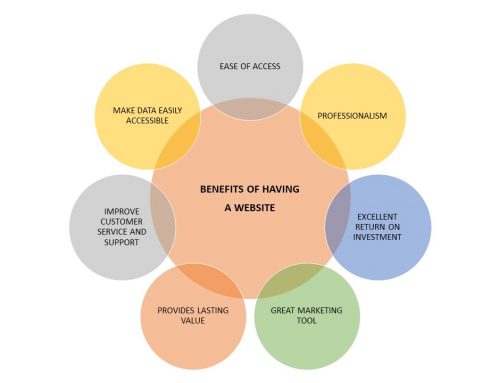
Benefits of Responsive Web Design for Birmingham Restaurants
Responsive web design isn’t just a technical feature—it’s a strategic asset that Birmingham restaurants can leverage to elevate their digital presence. In this section, we’ll delve into the manifold benefits of responsive web design, from enhancing user experience and engagement to boosting mobile traffic, conversions, and SEO performance.
Improved User Experience and Engagement
In the competitive realm of Birmingham’s dining scene, a restaurant’s online presence is often the first point of contact with potential patrons. Responsive web design transforms this digital interaction into a delightful experience. Here’s how:
- Easy Navigation: Responsive websites prioritize user-friendly navigation. Birmingham restaurant websites that adapt seamlessly to various screen sizes ensure that visitors can effortlessly explore menus, view restaurant images, check operating hours, and find essential information without the frustration of endless scrolling or zooming.
- Readable Content: The legibility of your website’s content is paramount. Responsive design optimizes text size, font choices, and spacing to guarantee that your menu descriptions, blog posts, and contact details remain easily readable on every device. No more squinting or constant adjustments required.
- Optimized Images: Birmingham residents want to see what your restaurant has to offer. Responsive web design ensures that images load quickly and display beautifully, enticing potential diners with mouthwatering dishes and an ambiance that beckons them to visit.
A positive user experience and engagement go hand in hand with responsive web design. When your website caters to the needs and preferences of visitors, you’re more likely to keep them engaged and interested in what your restaurant has to offer.
Increased Mobile Traffic and Conversions
The mobile device in your pocket or purse is more than just a phone—it’s a gateway to dining experiences. Birmingham residents use their smartphones for much more than browsing; they’re making decisions and taking action. Responsive web design capitalizes on this trend by driving increased mobile traffic and conversions:
- Seamless Booking and Ordering: Birmingham residents appreciate convenience. A responsive restaurant website ensures that the process of booking a table or placing an order is effortless on mobile devices. Streamlined forms, clear calls to action, and intuitive interfaces encourage users to take action, increasing the likelihood of reservations and orders.
- Fast Loading Times: In the fast-paced digital world, slow-loading websites are a recipe for frustration. Responsive design optimizes images, minimizes unnecessary elements, and prioritizes loading speed. For Birmingham restaurants, this translates to reduced bounce rates and increased conversions as users are less likely to abandon a slow-loading website.
Responsive web design isn’t just about making your website look good on mobile devices; it’s about making it function seamlessly, creating an environment where Birmingham residents can interact with your restaurant effortlessly, leading to more reservations, orders, and satisfied customers.
Search Engine Optimization (SEO) Benefits
Responsive web design isn’t just a user-focused strategy; it’s also a favorite of search engines like Google. The SEO benefits it offers can significantly impact the online visibility of Birmingham restaurants:
- Favorable Search Engine Ranking: Search engines prioritize user experience when determining rankings. Responsive websites provide a consistent and user-friendly experience across devices, which search engines reward with higher search rankings. Birmingham restaurants with responsive sites are more likely to appear at the top of search results, increasing their online visibility.
- Consolidated SEO Efforts: Maintaining multiple versions of a website—one for desktop and another for mobile—can be resource-intensive and complex. Responsive design streamlines your SEO efforts, as there’s only one website to optimize, one set of content to manage, and one SEO strategy to execute.
Responsive web design aligns perfectly with the SEO requirements of Birmingham restaurants, offering a pathway to better visibility and higher search rankings. It’s a strategy that not only caters to the preferences of mobile users but also satisfies the algorithms of search engines.
The benefits of responsive web design for Birmingham restaurants are vast and impactful. Enhanced user experiences, increased mobile traffic and conversions, and favorable SEO rankings are a few of the dividends that responsive design pays. For restaurants in Birmingham’s competitive dining landscape, responsive web design isn’t just a trend; it’s a smart investment in the digital future.
Essential Features of Responsive Web Design for Birmingham Restaurants
Creating a responsive website for your Birmingham restaurant involves more than just fitting content onto various screens. It’s about providing an exceptional digital experience for your diners. In this section, we’ll explore the essential features of responsive web design that are tailor-made for Birmingham restaurants.
Mobile-Friendly Layout and Navigation
For Birmingham restaurants, a mobile-friendly layout and navigation system are the bread and butter of a responsive website. Here’s why they matter:
- Clear Menus: Birmingham residents visit restaurant websites for one primary reason—to explore your menu. Responsive design ensures that your menu is easily accessible and perfectly legible on smartphones and tablets. Whether it’s viewing your signature dishes, checking prices, or investigating dietary options, a well-structured menu enhances user experience and encourages diners to make informed choices.
- Intuitive Design: Mobile users are typically on the move or have limited time to browse. Birmingham restaurant websites should present information in an intuitive and user-friendly manner. Responsive design prioritizes content hierarchy, making sure that vital details like your location, hours of operation, and contact information are readily available and easily discoverable.
- Easy Access to Important Information: When a Birmingham resident is deciding where to dine, they’re looking for convenience. Responsive web design guarantees that your website’s layout adapts to mobile screens, avoiding awkward zooming or scrolling. This makes it effortless for users to find the essential information they need, such as your phone number for reservations or your address for directions.
A mobile-friendly layout and navigation aren’t just features of responsive web design—they’re the cornerstones of a positive user experience that can encourage potential diners to choose your restaurant.
Fast Loading Speed and Performance
In the world of online interactions, every second counts. Slow-loading websites are notorious for driving users away. For Birmingham restaurants, fast loading speed and optimal performance are non-negotiable. Here’s why:
- User Frustration: Birmingham residents expect websites to load quickly, especially when they’re on the go. Slow-loading websites frustrate users, increasing the likelihood that they’ll leave your site in search of a faster alternative.
- Mobile Optimization: Birmingham residents often use their smartphones for quick, on-the-fly searches. A responsive website that loads swiftly on mobile devices ensures that potential diners can access your information promptly, increasing the chances that they’ll visit your restaurant.
- Optimized Images: Rich, high-quality images of your restaurant’s dishes are essential for enticing Birmingham residents. Responsive design optimizes images to maintain their quality while minimizing file size, ensuring quick loading times even on mobile devices.
- Minimized Code: Responsive web design eliminates the need for duplicate content and reduces code complexity. This results in faster loading times, providing a seamless experience for your potential diners.
- Caching: Caching techniques can be employed to store certain elements of your website on a user’s device, reducing the need to re-download content upon each visit. This further improves loading speed and performance for Birmingham restaurant websites.
A responsive website that loads quickly and performs optimally on all devices is an investment in the satisfaction of your potential diners. It ensures that Birmingham residents can access your restaurant’s information swiftly and efficiently.
Seamless Integration of Online Reservations and Ordering
In an era where convenience reigns supreme, Birmingham restaurant websites should seamlessly integrate online reservations and ordering systems. Here’s why it’s essential:
- Convenience: Birmingham residents appreciate the convenience of making reservations or placing orders online. Responsive web design ensures that these features are accessible and user-friendly on mobile devices, making it easy for potential diners to take action directly from their smartphones or tablets.
- Increased Conversions: The ability to make reservations or place orders online can significantly increase conversions for Birmingham restaurants. A responsive website guarantees that this process is smooth, encouraging potential diners to commit to visiting or ordering from your restaurant.
A responsive website for Birmingham restaurants isn’t complete without the seamless integration of online reservations and ordering systems. This feature aligns with the expectations of modern diners and can be a key differentiator in a competitive culinary landscape.
Responsive web design for Birmingham restaurants encompasses critical features that enhance user experience and facilitate engagement. From mobile-friendly layouts and navigation to fast loading speed and the seamless integration of online reservations and ordering, these elements collectively contribute to a restaurant’s digital success in Birmingham’s thriving dining scene.
Case Studies: Successful Examples of Responsive Web Design for Birmingham Restaurants
Let’s explore two compelling case studies of Birmingham restaurants, Lloyd’s Restaurant and Eat Smoke Bistro, which have harnessed the power of responsive web design to drive online success and elevate customer satisfaction.
- Lloyd’s Restaurant
- Background: Lloyd’s Restaurant, a beloved family restaurant in Birmingham, realized that many of its website visitors were accessing their site on mobile devices. They decided to invest in responsive web design to enhance the experience for these mobile users.
- Outcome: After implementing responsive design, Lloyd’s Restaurant saw a remarkable surge in mobile traffic. The mobile-friendly layout and intuitive navigation made it easier for customers to explore their extensive menu and daily specials, resulting in a noticeable increase in reservations and online orders.
- Customer Satisfaction: Customers praised Lloyd’s for its user-friendly website, particularly on mobile devices. This positive feedback contributed to a boost in customer loyalty and word-of-mouth recommendations.
- Eat Smoke Bistro
- Background: Eat Smoke Bistro, known for its mouthwatering barbecue cuisine, aimed to tap into the growing trend of online food orders and reservations. They chose responsive web design to ensure a seamless experience for customers, regardless of the device they used.
- Outcome: Responsive design transformed the online ordering process for Eat Smoke Bistro. Customers could now easily place orders from their smartphones or desktops, leading to a significant increase in takeout and delivery orders. Additionally, the streamlined reservation system resulted in more bookings, especially for special occasions.
- Customer Satisfaction: Eat Smoke Bistro’s patrons appreciated the convenience of their responsive website. The visually appealing menu and straightforward ordering process were frequently cited as reasons for their satisfaction. Positive online reviews further solidified the restaurant’s reputation as a go-to spot for barbecue lovers.
These case studies, featuring Lloyd’s Restaurant and Eat Smoke Bistro, illustrate how responsive web design can be a game-changer for Birmingham restaurants. By adapting to the preferences of mobile users and providing a user-friendly experience, these establishments not only experienced increased online traffic and conversions but also garnered praise from customers for their accessible and visually appealing websites. Responsive design, as demonstrated by these examples, has emerged as a driving force behind online success in Birmingham’s restaurant industry.
Implementing Responsive Web Design for Birmingham Restaurants
Implementing responsive web design for Birmingham restaurants requires careful planning and execution. Here are the key steps involved in this process:
- Assessment and Planning:
- Begin by assessing your current website and identifying its shortcomings, especially in terms of mobile-friendliness.
- Set clear objectives for your responsive redesign. Determine what you want to achieve, whether it’s increasing online reservations, boosting online orders, or improving overall user experience.
- Create a sitemap and define the structure of your new responsive website, ensuring that it caters to both desktop and mobile users.
- Professional Web Design and Development:
- Collaborate with professional web designers and developers who specialize in responsive design. Their expertise is crucial in ensuring that your website functions seamlessly on all devices.
- Work closely with the design team to create a mobile-friendly layout that aligns with your restaurant’s branding and aesthetics. This includes optimizing images, typography, and content for various screen sizes.
- Responsive Frameworks:
- Consider using responsive web design frameworks like Bootstrap or Foundation. These frameworks provide a solid foundation for building responsive websites and can speed up the development process.
- Mobile-Friendly Content:
- Ensure that all content, including menus, images, and text, is optimized for mobile viewing. This may involve reformatting menus for smaller screens and compressing images for faster loading times.
- User Testing:
- Conduct thorough user testing on different devices and browsers to identify any issues or inconsistencies. This step is crucial for ironing out any responsive design glitches and ensuring a seamless user experience.
- Optimized Performance:
- Pay close attention to performance optimization. This includes minimizing code, leveraging browser caching, and implementing content delivery networks (CDNs) to ensure fast loading times.
- SEO Considerations:
- Don’t forget about search engine optimization (SEO). Ensure that your responsive website is optimized for local SEO, including meta tags, headings, and structured data markup.
- Cross-Browser Compatibility:
- Test your responsive website on various web browsers to ensure cross-browser compatibility. Your site should function flawlessly on popular browsers like Chrome, Firefox, Safari, and Edge.
- Launch and Promotion:
- Once your responsive website is thoroughly tested and optimized, it’s time for launch. Promote your new website through social media, email marketing, and other digital channels to inform your existing and potential customers.
- Ongoing Maintenance:
- Regularly update your website with fresh content, menu changes, and special promotions to keep customers engaged and informed. Additionally, monitor website analytics to track user behavior and identify areas for improvement.
Implementing responsive web design for Birmingham restaurants involves a strategic approach that combines professional expertise, user testing, and optimization for both performance and SEO. By following these steps and working with experienced designers and developers, your restaurant can create a responsive website that enhances the user experience and drives online success.
Embracing Responsive Web Design for Birmingham Restaurants
In embracing responsive web design, Birmingham restaurants unlock a world of opportunities to enhance their online presence and ensure they remain competitive in the digital age.
Key Takeaways:
- Enhanced User Experience: Responsive design paves the way for an improved user experience across devices, ensuring that potential diners can easily access menus, make reservations, and explore offerings seamlessly.
- Increased Mobile Traffic and Conversions: With the surge in mobile internet usage, responsive websites attract a larger share of mobile traffic and convert more visitors into loyal customers.
- Improved Search Engine Rankings: Search engines favor responsive websites, leading to higher search rankings. This visibility can significantly impact a restaurant’s discoverability.
In a world where diners increasingly rely on mobile devices to discover and interact with restaurants, responsive web design is not merely an option—it’s a necessity. By investing in responsive design, Birmingham restaurants can thrive in the digital landscape, offering patrons a delightful online experience that mirrors the excellence they provide in their dining establishments.